Product
Introducing Enhanced Alert Actions and Triage Functionality
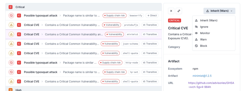
Socket now supports four distinct alert actions instead of the previous two, and alert triaging allows users to override the actions taken for all individual alerts.
react-icons
Advanced tools
Package description
The react-icons package provides a large collection of icons from various icon libraries that can be easily used in React applications. It allows developers to include icons using React components, which can be styled and manipulated like any other React component.
Importing and using an icon
This feature allows you to import an icon from a specific icon library (in this case, Font Awesome) and use it as a React component in your application.
import { FaBeer } from 'react-icons/fa';
function App() {
return <h3> Lets go for a <FaBeer />? </h3>;
}Styling icons
Icons can be styled using inline styles or CSS classes, just like any other React component. This code sample demonstrates inline styling to change the color and size of the icon.
import { FaBeer } from 'react-icons/fa';

function App() {
  return <FaBeer style={{ color: 'blue', fontSize: '50px' }} />;
}
Combining icons with other components
React-icons can be easily combined with other components, such as buttons from a UI library like React Bootstrap. This allows for more complex and visually appealing components.
import { FaBeer } from 'react-icons/fa';
import { Button } from 'react-bootstrap';

function App() {
  return (
    <Button variant='primary'>
      Order a beer <FaBeer />
    </Button>
  );
}This package provides icons from Google's Material Design. It is similar to react-icons but is specifically designed to work with Material-UI components. It offers a consistent look and feel for projects that use Material-UI.
This is a set of Material Design Icons for React. It is similar to react-icons in that it provides a large set of icons, but it is focused solely on Material Design Icons, whereas react-icons offers icons from multiple libraries.
This package is a React component for Font Awesome icons. It is similar to react-icons, but it is dedicated to Font Awesome icons only. react-icons, on the other hand, includes Font Awesome among many other icon libraries.
Readme
Include popular icons in your React projects easily with react-icons, which utilizes ES6 imports that allows you to include only the icons that your project is using.
yarn add react-icons
npm install react-icons --save
import { FaBeer } from 'react-icons/fa';

class Question extends React.Component {
    render() {
        return <h3> Lets go for a <FaBeer />? </h3>
    }
}
View the documentation for further usage examples and how to use icons from other packages. NOTE: each Icon package has it's own subfolder under react-icons you import from.
For example, to use an icon from Material Design, your import would be: import { ICON_NAME } from 'react-icons/md';
| Icon Library | License | Version |
|---|---|---|
| Font Awesome | CC BY 4.0 License | 5.12.1 |
| Ionicons | MIT | 4.5.6 |
| Material Design icons | Apache License Version 2.0 | 3.0.1 |
| Typicons | CC BY-SA 3.0 | 2.0.9 |
| Github Octicons icons | MIT | 8.5.0 |
| Feather | MIT | 4.21.0 |
| Game Icons | CC BY 3.0 | a53463d41d4f055fa71097ae74da4c508c9bb09d |
| Weather Icons | SIL OFL 1.1 | 2.0.10 |
| Devicons | MIT | 1.8.0 |
| Ant Design Icons | MIT | 4.0.0 |
| Bootstrap Icons | MIT | 1.0.0-alpha3 |
| Remix Icon | Apache License Version 2.0 | 2.3.0 |
| Flat Color Icons | MIT | 1.0.2 |
| Grommet-Icons | Apache License Version 2.0 | 4.4.0 |
| Simple Icons | CC0 1.0 Universal | 2.13.0 |
| IcoMoon Free | CC BY 4.0 License | 1.0.0 |
| BoxIcons | CC BY 4.0 License | 2.0.5 |
| css.gg | MIT | 2.0.0 |
| VS Code Icons | CC BY 4.0 | 0.0.1 |
You can add more icons by submitting pull requests or creating issues.
You can configure react-icons props using React Context API.
Requires React 16.3 or higher.
import { IconContext } from "react-icons";

<IconContext.Provider value={{ color: "blue", className: "global-class-name" }}>
  <div>
    <FaFolder />
  </div>
</IconContext.Provider>
| Key | Default | Notes |
|---|---|---|
color | undefined (inherit) | |
size | 1em | |
className | undefined | |
style | undefined | Can overwrite size and color |
attr | undefined | Overwritten by other attributes |
title | undefined | Icon description for accessibility |
Import path has changed. You need to rewrite from the old style.
// OLD IMPORT STYLE
import FaBeer from 'react-icons/lib/fa/beer';

class Question extends React.Component {
    render() {
        return <h3> Lets go for a <FaBeer />? </h3>
    }
}
// NEW IMPORT STYLE
import { FaBeer } from 'react-icons/fa';

class Question extends React.Component {
    render() {
        return <h3> Lets go for a <FaBeer />? </h3>
    }
}
Ending up with a large JS bundle? Check out this issue.
From version 3, vertical-align: middle is not automatically given. Please use IconContext to specify className or specify an inline style.
<IconContext.Provider value={{ style: { verticalAlign: 'middle' } }}>
className StylingComponent
<IconContext.Provider value={{ className: 'react-icons' }}>
CSS
.react-icons {
  vertical-align: middle;
}
Dependencies on @types/react-icons can be deleted.
yarn remove @types/react-icons
npm remove @types/react-icons
yarn
yarn submodule  # fetch icon sources
cd packages/react-icons
yarn build
The preview site is the react-icons website, built in NextJS.
cd packages/react-icons
yarn build

cd ../preview
yarn start
The demo is a Create React App boilerplate with react-icons added as a dependency for easy testing.
cd packages/react-icons
yarn build

cd ../demo
yarn start
SVG is supported by all major browsers. With react-icons, you can serve only the needed icons instead of one big font file to the users, helping you to recognize which icons are used in your project.
MIT
FAQs
SVG React icons of popular icon packs using ES6 imports
The npm package react-icons receives a total of 2,002,680 weekly downloads. As such, react-icons popularity was classified as popular.
We found that react-icons demonstrated a healthy version release cadence and project activity because the last version was released less than a year ago. It has 5 open source maintainers collaborating on the project.
Did you know?

Socket for GitHub automatically highlights issues in each pull request and monitors the health of all your open source dependencies. Discover the contents of your packages and block harmful activity before you install or update your dependencies.

Product
Socket now supports four distinct alert actions instead of the previous two, and alert triaging allows users to override the actions taken for all individual alerts.

Security News
Polyfill.io has been serving malware for months via its CDN, after the project's open source maintainer sold the service to a company based in China.

Security News
OpenSSF is warning open source maintainers to stay vigilant against reputation farming on GitHub, where users artificially inflate their status by manipulating interactions on closed issues and PRs.